Photography

Textures and Portable Flash

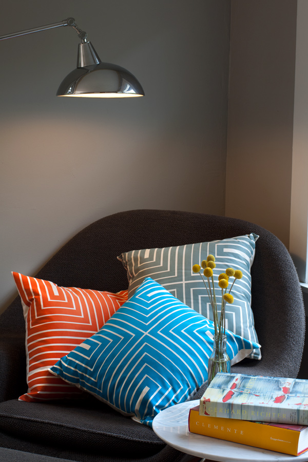
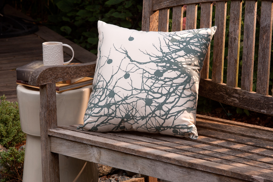
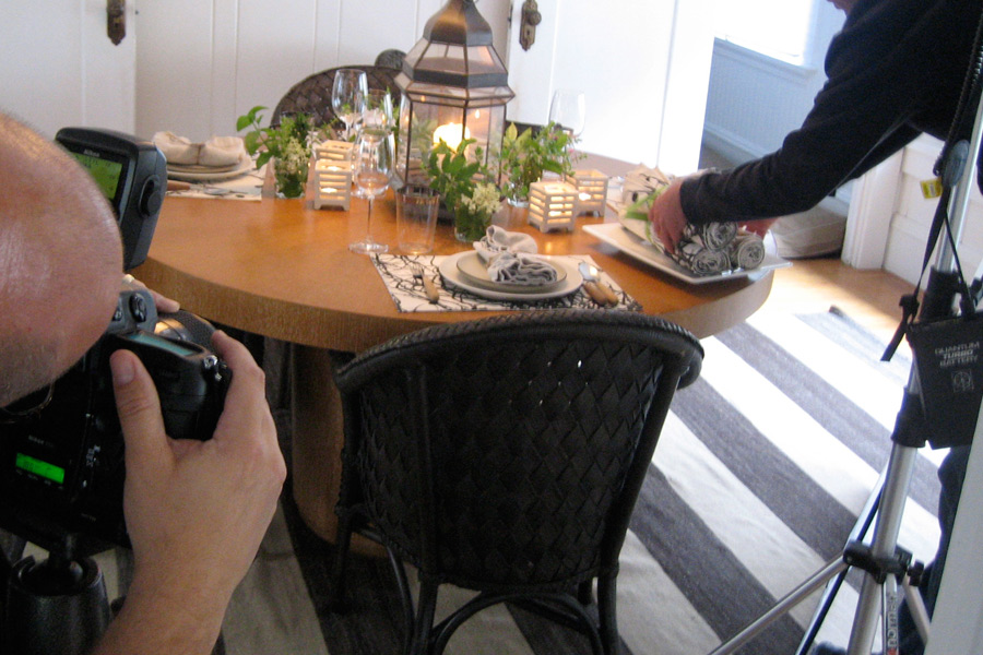
Since photographing products are a common request, I can say over my career I have photographed quite a variety. From toasters to washers and dryers to jewelry to bedspreads, I've done quite a bit.  On this particular day we were photographing designer pillows.  These are all hand-made from a small company in Fairfax, CA, Twig and Cricket. Our challenge was to show the texture in the product as it was in a natural surroundings of a home in Oakland, CA.


Nothing like a great shot of my bald head.

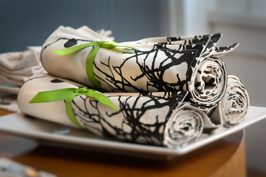
The lighting was pretty simple.  Start with a nice overcast day in the early morning so light is filtering through all the windows.  I added a small strobe, a battery operated SB-800 on a wireless trigger, to hit the subject with a just a tick of fill light.  This was shot with a very shallow depth of field to bring out the texture in the napkins.


Again, we used daylight from the windows and a portable flash with a slight warming gel to light up the front of the pillows.

We photographed the whole line of pillows in the same set-up so the owner could use what she wanted in different parts of the web site.


Warm light added with portable flash.

We set up and shot several outdoor photographs early that morning. Since the light was flat, we added a portable Nikon SB-800 with a warming gel off to the right to add some texture and give it that morning glow.

Before and After

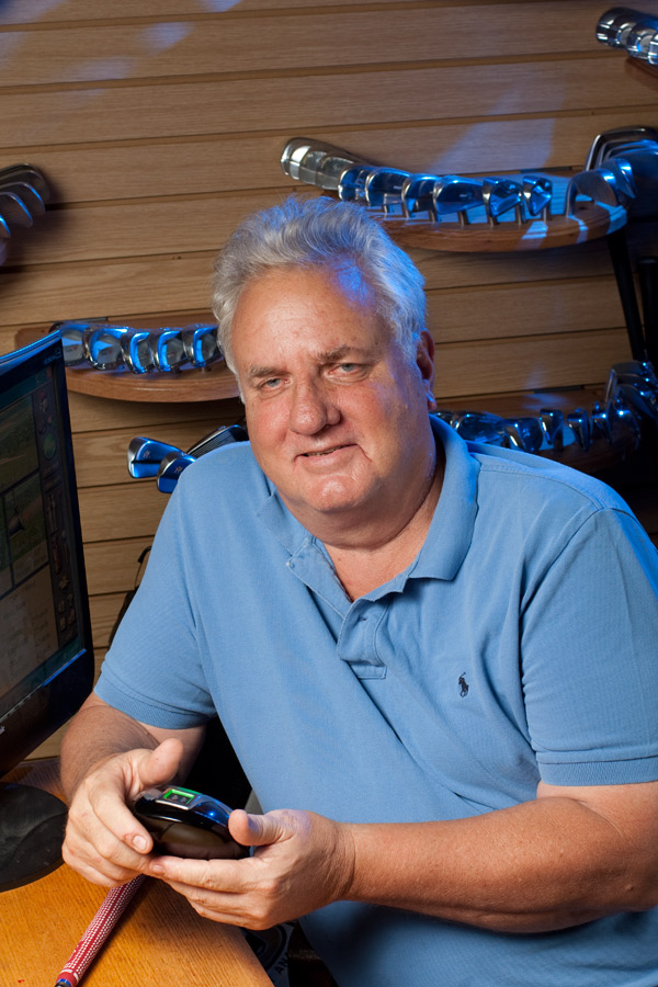
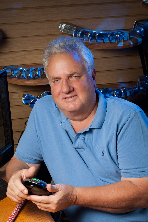
Last week I was asked to create an image for a cover of Golf Today Magazine.  I had little time since the deadline was only a day away. Upon arrival, I found some of my background options limited.  The lighting was poor, (florescent lights from above), so I knew I had to add my own light. With all the product gathered around in this shop, I couldn't use my large studio lights because I just didn't have the space.  So I used a couple of small SB800 lights and I used the TTL in the Nikon system for exposure. This is a fantastic way to get a good artificial light exposure quickly.

With one light into place I saw that I had a nice soft light as my main light and I had to add a background light.  Since this was a scientific lab (for golf) I decided to gel the background light with a blue gel and lower the exposure for that light to get a richer blue.

With the lights adding blue, I had the subject change his shirt to a blue to match the colors on the steel club heads in the background. I then went into Photoshop and spent some time bringing out his eyes, softening the skin and other normal retouching processes.

Before Enhancements

After Enhancements

Finally it was sent to the magazine just under deadline and here is the mock up from the magazine.

GT_Cover-1

Photoshop Planning with Interiors

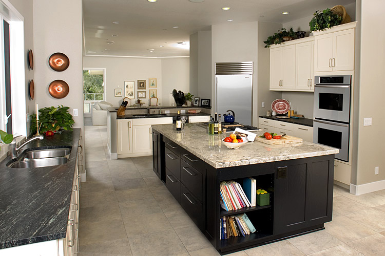
When I am asked to create an image of an interior, I plan my shoot knowing I am going to be able to use Photoshop to complete the image. In the above image I used only two lights for this entire image.  I did however use the lights over and over to create about 15 different photographs.  Later in Photoshop, I sandwich all of the images and through the use of layer masks, I take the "lighting" from each image. Fisher_Fairfield

Check out the video to see how I create interior photographs with the planned use of Photoshop.

interior-sample-part-1

Copyright 2015, Terry VanderHeiden