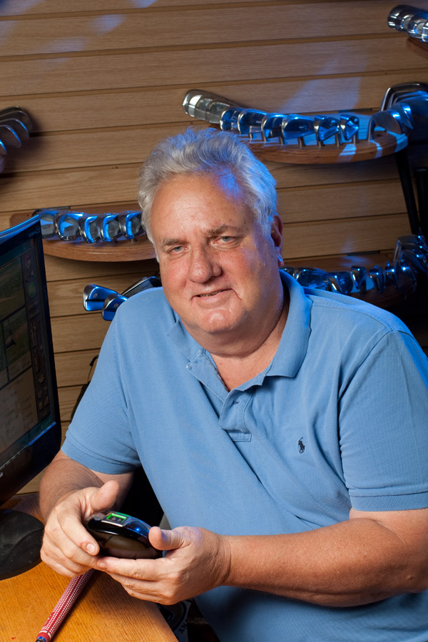
Last week I was asked to create an image for a cover of Golf Today Magazine. I had little time since the deadline was only a day away. Upon arrival, I found some of my background options limited. The lighting was poor, (florescent lights from above), so I knew I had to add my own light. With all the product gathered around in this shop, I couldn't use my large studio lights because I just didn't have the space. So I used a couple of small SB800 lights and I used the TTL in the Nikon system for exposure. This is a fantastic way to get a good artificial light exposure quickly.
With one light into place I saw that I had a nice soft light as my main light and I had to add a background light. Since this was a scientific lab (for golf) I decided to gel the background light with a blue gel and lower the exposure for that light to get a richer blue.
With the lights adding blue, I had the subject change his shirt to a blue to match the colors on the steel club heads in the background. I then went into Photoshop and spent some time bringing out his eyes, softening the skin and other normal retouching processes.


Finally it was sent to the magazine just under deadline and here is the mock up from the magazine.
